

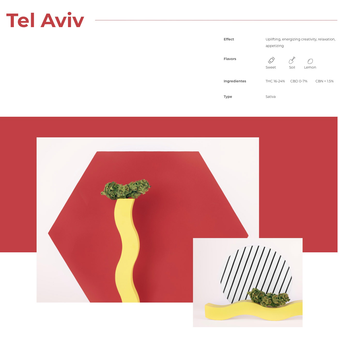
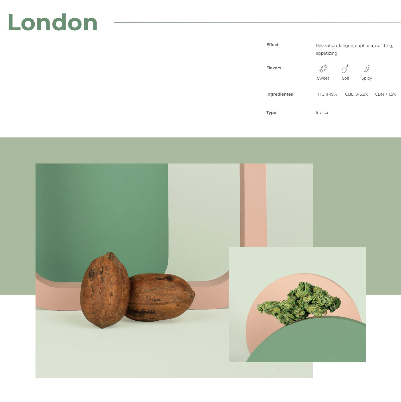
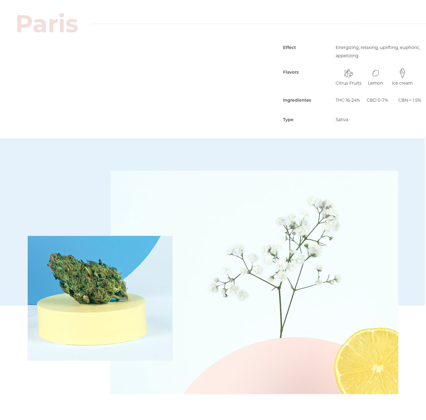


 in Tel Aviv
Accessibility statement
muze are committed to making our own website usable by all people, whatever their abilities or disabilities. Find the right technology to customise this site to your needs While the site has been created to be usable ‘as is’, many people are likely to get the most accessible experience of using this site by customising their computer to suit their individual needs.
- accesibility level :
- AA
- Browsers compability :
- Explorer 9 +
- Chrome
- firefox
- Safari
Change font size
You can increase and decrease the font size on the site.
Highlighting links
You can color the links with blue and underline them
Changing colors to grey scale
You can change the colors of the site is convenient and easy to read.
Contrast Areas
You can change the background to black or white
mouse pointer
You can change the mouse arrow , scale it and color it ( black or white )
Let us know if you have difficulties using this site If you find anything on the site difficult to use please let us know : hello@muzedesign.com
This statement was last updated on 30th of august 2016